Digital Design
Digital design is one of the fastest and most important industries today in our field. Digital design ensures we have useful experiences in the online world. My digital design experience began young, I grew with the technology as it was developed and as such a lot of the skills became baked into me. I’ve developed websites and worked on updating web designs, I have used new technology to spearhead new ideas in our industry, I have built working prototypes that are in use today, developed professional email templates, created high quality mobile ads, icons, motion graphics and digital assets.
Whitepages
Whitepages is a data management company with the goal of building trusted connections in todays digital world. They are dedicated to making sure their clients stay connected, protected, and make informed decisions. All values and beliefs I share and during my time there I was able to showcase my expertise in helping them achieve these goals.


One of the projects I am most proud of from my time at Whitepages was the Diversity and Equality web page updates. I worked closely with the CEO, Leigh McMillan, and HR to deliver a new and fresh look that upheld branding standards across the website and presented current information.
What I began with was a very out of date design that was being held together by paper clips and promises, and it was in a bit of a tangled mess behind the scenes. It was a new undertaking for me with the attention of some important eyes. Most importantly I knew, no mater what I needed to make sure any of my work did not cause an entire site wide issue as everything was so intertwined much like a Jenga puzzle of code.
After completing this project, I wanted to make sure I left it better than I found it. I developed an easy edit system so future updated could be easily made without the same struggle I went through.
I am very pleased with the end product which remains in use today.
https://about.whitepages.com/diversity-equality/
App Store and Prototyping
Most of my time at Whitepages was used to prototype new flows and user interfaces and create new images for various app stores.


Prototyping with payment and account management
Building to the future
While I was at Whitepages I had the pleasure and fortune to take part in their annual Hackathon. I lent my design expertise to a project team working on new ideas for Knowing you Neighbors. A tool for perspective home buyers, businesses, and realtors. Giving quick access to information on the area you live in. We developed a rough working model that used real data and presented it to the company.


I designed an icon system that would allow information at a glance.

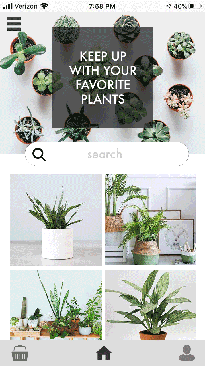
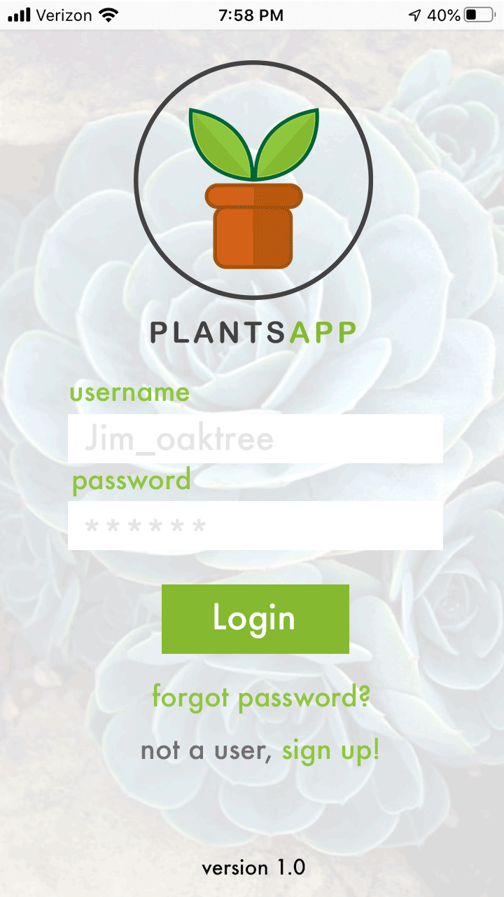
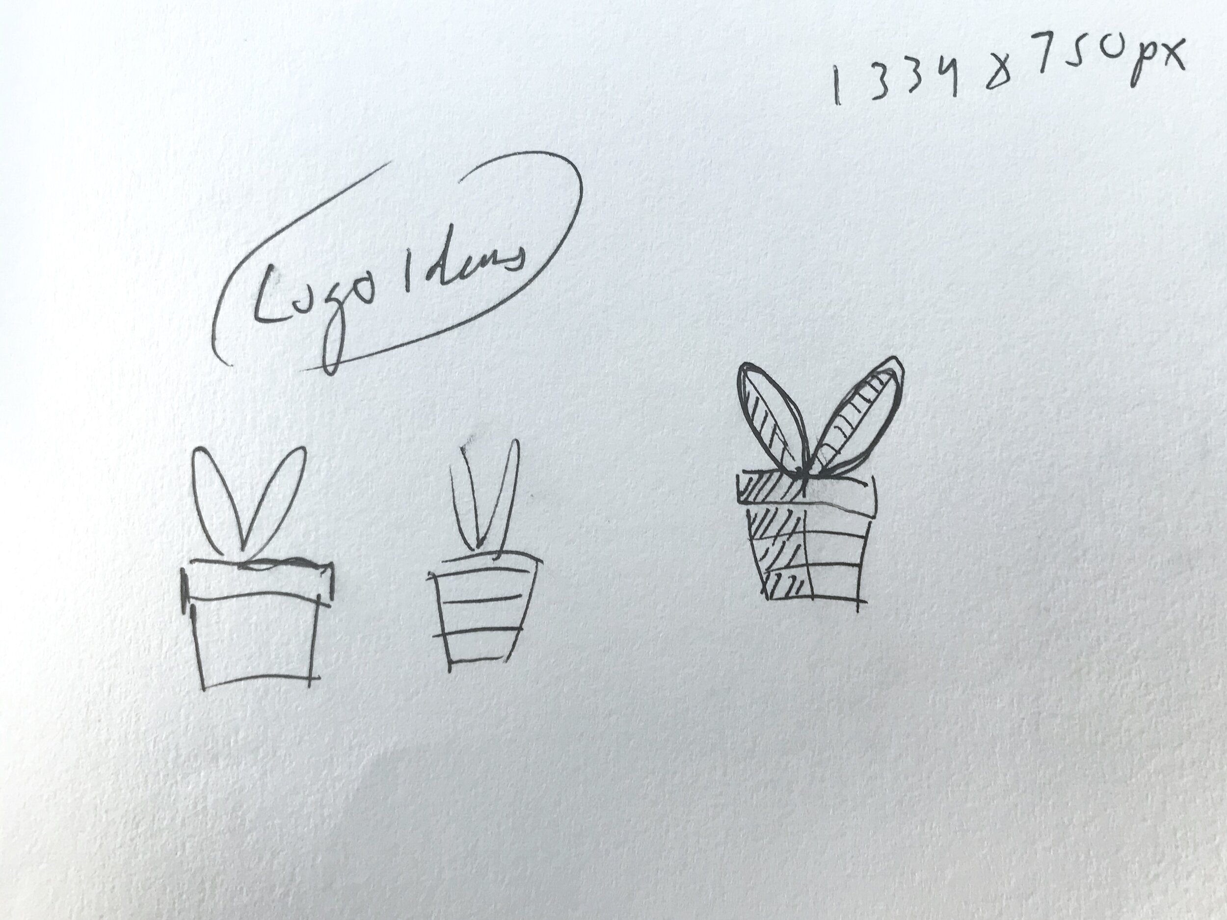
Plantsapp
Millennials, like myself love house plants. They bring color, fresh air, and life to our homes. According to the National Gardening Association, house plant sales in the U.S. have more than doubled in the last three years alone, turning house plants into an almost $2 billion industry.
One thing I noticed right away as a plant owner, was that each of my plants needed different care. Some like direct light while others like indirect or shade, some need water daily while others only need water once every other week or so. Some need indoor potting soil, some need cactus soil, and some don’t need soil at all. There was so much to know about plant care, and I didn’t really know where to look or what info to listen to. I read some books, watched some videos, read articles online. There was lots information out there but the barrier to entry was large enough that a lot of people feel discouraged to try and keep house plants. I thought to myself, it would be great if there was a resource where plant owners could share knowledge and resources easily, where you could find the facts you need quickly and easily and compare results with others. That’s when I came up with the idea for Plantsapp.
Plantsapp is more than just an encyclopedia or a forum page. Plantsapp is a community hub. A place where indoor plant owners can come together to learn and grow with each other and their plants. I wanted to create connections, to build a better point of entry, and join the growing market of indoor plant businesses.

Plantsapp login page.
Mobile App Design

I wanted the design of Plantsapp to achieve two main goals, be user friendly, and keep the focus on the plants. To do this I knew I wanted a design that was clean and simple. I didn’t want users to get bogged down by tangents. I did research, looked at layouts and ideas that were clean and user friendly. I saw simple icons and light and simple colors, so those became the elements I looked to add into Plantsapp. I utilized white space to make the add feel bright and clean to promote the plants being featured as well as give the user the same feeling of freshness plants give them. Plants are already so colorful, there is nothing better to fill the app with than images of plants.
Sketches & Wireframes
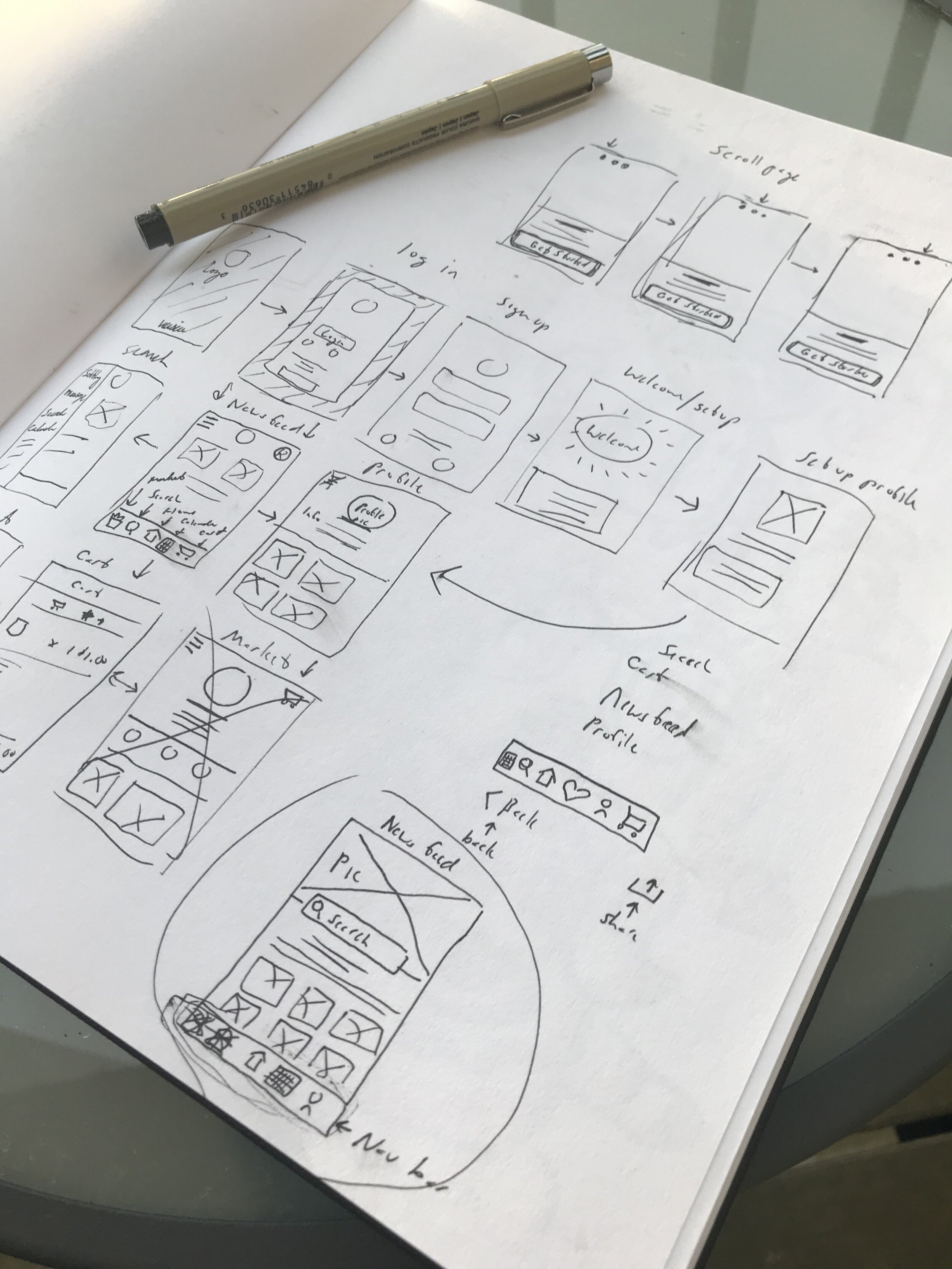
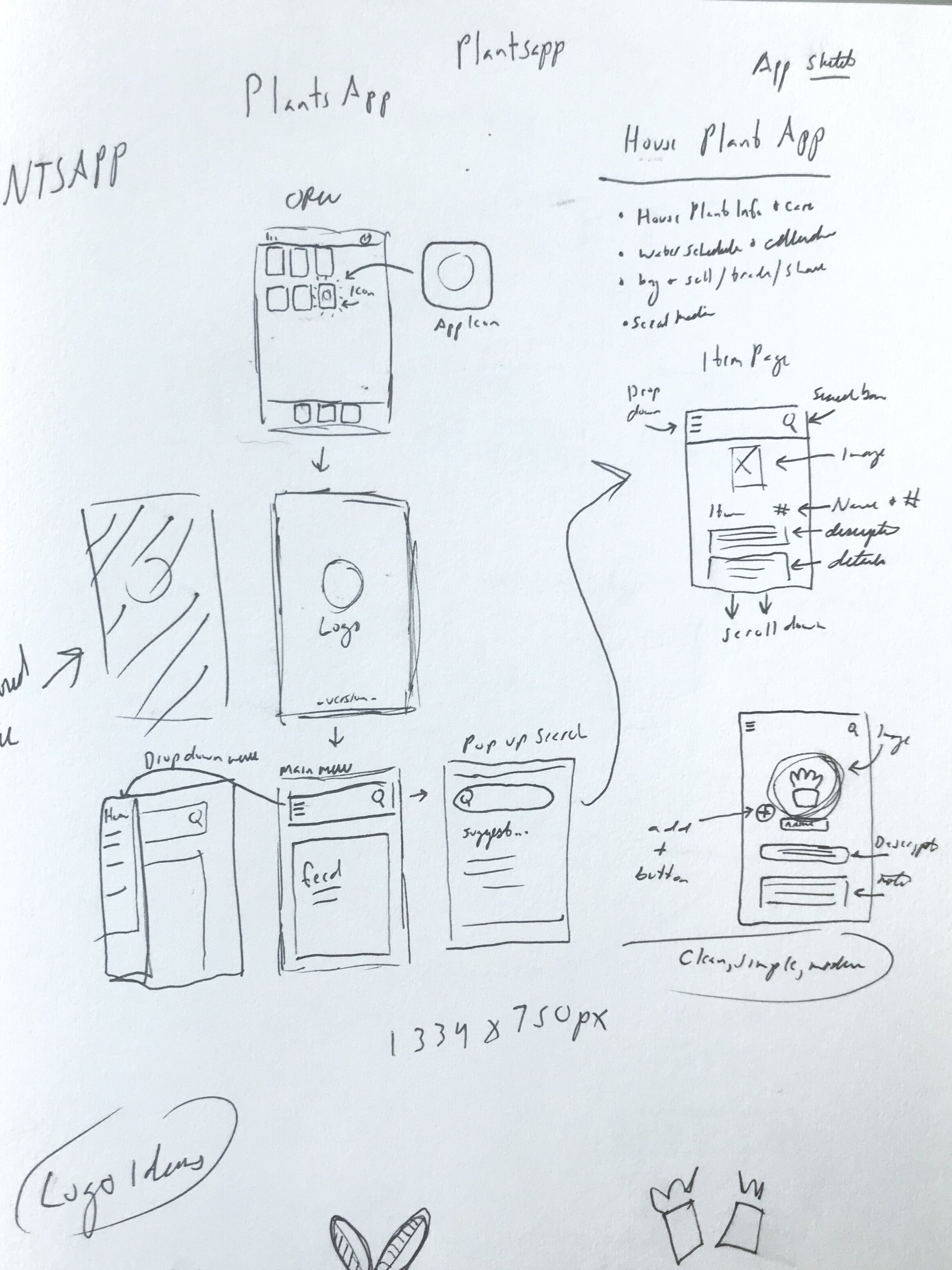
When beginning a new project I always start with some good old fashioned paper and pen. Drawing out sketches, scribbling down notes, and locking down my ideas. Though this process of sketching, I create a draft of my draft. This is so useful and often overlooked as a useful step in the creative process. Once I’ve got my sketches and notes really dialed in, I’m starting out with my first draft far more confident and solid in the design. It saves time and effort.
When working on an app specifically there are so many factors to consider. What will the flow be like, how is your audience navigating the interface, are they able to find what they’re looking for. With my sketches I can quickly thumbnail a million ideas, build out any crazy idea, and even if its something that won’t work in the end I don’t feel like I’ve waisted my time.

Sound Video Network
Sound Video Network is a brand-new in-store digital video technology that strategically aligns your video message in an integrated location-based network while utilizing demographic audiences and data reporting which optimizes consumer behaviors, increasing revenues and brand lift.

I joined Sound Video Network at the ground floor. I was one of about five others on the team and the sole creative. When SVN (Sound Video Network) was launched is was basically a start up inside another company with a basic idea we had inherited from a sister company. Our team had to build everything from the ground up with little to no resources.

It’s not an unknown fact that print media has been having a difficult time in this digital age we live in. News papers and magazines across the globe are struggling to keep afloat. SVN is a solution for this very issue. By adding a new digital technology we could attract younger markets and an audience that might otherwise stray away from print, and by placing that new technology at the entry point for our product we created a seamless connection to our untapped market. With live demographic data reporting we were able to get instant results and build case studies to improve our design and interface thus furthering our effectiveness. In only three months time, not only did we see a massive jump in viewership but we also saw an increased interaction with young adults by more than fifty percent!!!

Old logo left, new logo right.
When I took on the creative for SVN, the first thing I needed to do was update the branding. I wanted the branding to reflect the business. Since SVN was to function as an entity within a larger company we wanted the look to both be its own thing but still feel and look related to Sound Publishing as a whole. So I started from scratch taking what works about the old design and reworking it better fit our look and needs. I matched the color of the the blue to the Sound Publishing logo as well as the type. I also made the play button in the middle more of a transparent gradient and less three solid blocks of color. I made the play icon larger and better fitting in the space.
Beyond the logo, there was a lot of work to be done. I had to build an all new SOP. I had to make new sight acquisition materials and sales materials. I made promo posters to get the word out. Everything we had been given was designed for Hawaii and so it had a vey Hawaiian look. I needed SVN to feel like PNW and the sound, so I really pushed images of the sound and Washington nature.
Daily Herald News (SVN)

Weekly news features provided by the Daily Herald aired on SVN.
A large part of my duties with SVN was to produce high quality ad videos and news highlight videos in addition to motion graphics. Weekly, we would produce videos featuring local news highlights reported by the Everett Daily Herald. I would take raw footage, photographs, and audio recordings and build high quality news segments to be aired on SVN. This not only helps to support the partnership of Sound Publishing and Sound Video Network but helps to engage readers within the local community building community bonds.
Email Design
Email design is a great way to make a powerful impact! A customer or client that has already supplied us with their email information to keep informed or stay up to date on our latest developments and changes is already more interested and invested in our product. That is incredibly valuable to have because it makes our job easier at building repeat business and long term relationships.
Email design is often overlooked but can make huge impacts. I, Myself, have even stopped and looked at emails much longer than I normally would if the design is iterate and fun. There is so much we can do with the design of emails now. They can be like a fun bright postcard with call to actions, preview pages for our websites or e-commerce locations, or even have interactive animations and videos. Imagine getting a customer shopping direct from their email without even needing to go to a website or investing them in a brand campaign just by opening an email.

John L Scott
Here is an example of an email design I built for John L Scott Corporate. They had made a recent development with their new ELEVATE system and were looking to expand and invest more of a client base with it. The idea was that Brokers could use this as a great new way to develop skills through coaching and community.
When I received this project, all I was supplied with was the basic information, concept, and branding materials. I wanted to create a design that would capture the simple and strong modern look of John L Scotts branding. I wanted to catch the eyes of a young and diverse business oriented audience. I wanted to make sure to showcase the product (ELEVATE & ROCKET FUEL).
